 Back to index
Accessibility recommendations
| ID |
WCAG |
Recommendations |
| 10.01 |
1.3.1
2.4.3 |
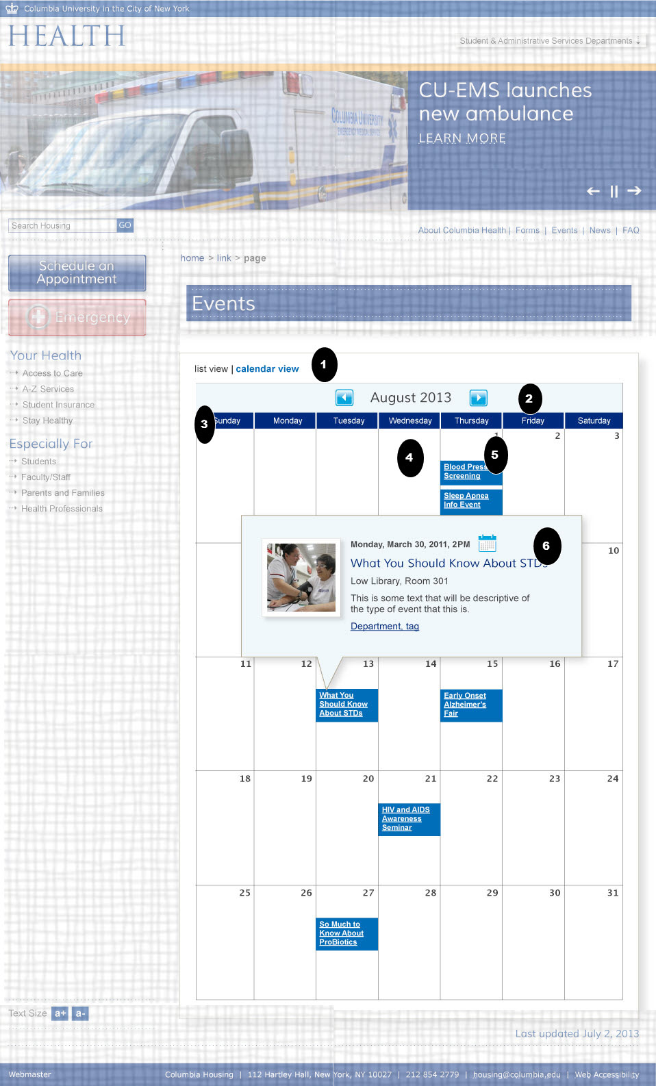
- Section Headings and Semantic Markup
- Use aria-selected = "true" on the active tab to make sure that not only presentation is used to show which tab panel is active. (The active tab is blue text, and the inactive tab is black.)
- Color Contrast (Creative)
- The Aqua color on white background is low contrast. T he color contrast luminosity ration between the font color and the background color needs to be at least 4.5 to 1 for text. The exception is for large text (18 point or 14 point bold) to only be required to have a color contrast ratio of 3 to 1.
- See http://snook.ca/technical/colour_contrast/colour.html
|
| 10.02 |
1.1.1
4.1.2
2.4.7
1.3.1 |
- Active Images and Name, Role Value
- Make sure the alt text for the two active images (Arrows) clearly describes their function. For example, "previous month (July)" and "next month (September)". Use an HTML input button or you can use a link with role="button". For example: <a href="foo.html" role="button"><img src ="foo.jpg" alt="Previous" /> </a>
- Focus Visible
- Visual focus must be evident on any element that you can tab to (like the arrow buttons). Test by tabbing through the page and confirm that you can visually tell where the focus is each time you tab.
- Section Headings
- The month can be marked up in as a second level headings
|
| 10.03 |
1.3.1 |
- Data Tables
- Use table headers in table cells to explicitly associate table cells with their headings.
For example:
<tr ><th scope="column">Monday</th><td>...</td>..</tr>
|
| 10.04 |
1.3.1
|
- Semantic Mark Up
- You can use aria-invalid = true on non selectable cells to show they are non selectable.
|
| 10.05 |
1.3.1
1.3.1
4.1.2
2.1.1 |
- Section Headings
- The day (1,2..) can be marked up in as third level headings
- Semantic Mark Up
- The color of the events visual show that they are events. Add this information by using aria-label="event" and mark up the text with <em> or <strong> tags.
- List of links should be marked up as lists. As the order is important they should be ordered lists.
.Keyboard Accessibility
- Keyboard Accessibility
- The links must be expandable via the keyboard and not just via a mouse. You can use the focus() or blur() events to support this. See http://accessibility.athena-ict.com/aria/Javascript-jquery-accessibility.shtml for details.
|
| 10.05 |
1.1.1
1.3.1
1.3.1
4.1.2
2.1.1
4.1.2
|
- Images
- Non clickable images with pictures should have a short description as alt text, such as alt ="nurse taking blood pressure". Purely decorative images must have an empty alt text (alt="").
- Section Headings and Semantic Markup
- Headings should be marked as secondary level header. The sub-titles further down should be marked up in as a third level headings.
- Semantic Mark Up
- The color of the events visual show that they are events. Add this information by using aria-label="event" and mark up the text with <em> or <strong> tags.
- List of links should be marked up as lists. As the order is important they should be ordered lists.
- Role Name Value (States)
- If CSS classes are used to toggle the visible display, that information should be semantically available by using aria-hidden. Toggle aria-hidden="true" when text is hidden and to ”false” when text is shown. See http://www.w3.org/TR/wai-aria-practices also my worked examples for dialogs -
- .Keyboard Accessibility
- Keyboard Accessibility
- The dialog must be closeable via the keyboard and not just via a mouse. You can use the focus() or blur() events to support this. See http://accessibility.athena-ict.com/aria/Javascript-jquery-accessibility.shtml for details.
- Managing focus
- The behavior of the dialog box should be predicable, such as the focus and keyboard behavior. I have two example -
- Dialog box - modal (with tutorial)
or see http://www.w3.org/TR/wai-aria-practices for more information on design patterns.
|
Note
 Indicates page components or parts of pages that are either out of scope or have already been covered in a previous comp.