 Back to index
Accessibility recommendations
| ID |
WCAG |
Recommendations |
| 09.01 |
1.3.1 |
Section Headings and Semantic Markup
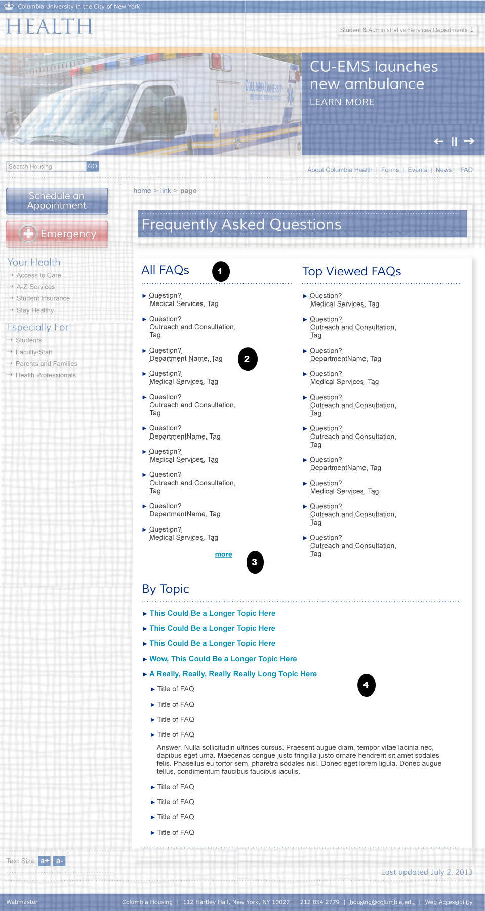
- "All FAQs" should be a secondary level header. The sub-titles further down should be marked up in as a third level headings.
|
| 09.02 |
1.3.1
1.3.1
2.4.3
1.1.1
4.1.2
1.1.1
2.1.1 |
- Semantic Mark Up
- List of links should be marked up as unordered lists.
- The links on the left of the panel control the content of the right hand side of the panel. The list container on the left should use the aria-controls attribute to explicitly show this relationship. See aria-controls.
- Focus and Reading Order
- Make sure the reading order (source code order) of the elements in this section are logical and convey the same meaning as the visual reading order of the section.
- Role Name Value (States)
- If CSS classes are used to toggle the visible display, that information should be semantically available by using aria-hidden. Toggle aria-hidden="true" when text is hidden and to ”false” when text is shown. Use aria-expanded on the link. See http://www.w3.org/TR/wai-aria-practices
- You should also use ARIA to make the information about the state of the link accessible to assistive technology by using aria-expanded. Toggle aria-expanded="true" when sub menu is shown and to ”false” when the sub menu is not shown.
- Images
- If the arrow icons to the left of these menu links show if the link is collapsed or expanded, then their alt text should state that information. (E.g. alt="expanded" ).
- Keyboard Accessibility
- The links on the left must be expandable via the keyboard and not just via a mouse. You can use the focus() or blur() events to support this. See http://accessibility.athena-ict.com/aria/Javascript-jquery-accessibility.shtml for details.
- If the links are not standard HTML anchors, tabindex may be needed so that the links will also support focus and be in the page tabbing order. See http://www.w3.org/TR/wai-aria-practices.
|
| 09.03 |
3.4
2.4.3 |
- Link Context
- The “more” link may need to have a title attribute or aria-label = "More FAQs" in order for the link to make sense out of context.
- Color Contrast (Creative)
- The Aqua color on white background is low contrast. T he color contrast lumonisity ration between the font color and the background color needs to be at least 4.5 to 1 for text. The exception is for large text (18 point or 14 point bold) to only be required to have a color contrast ratio of 3 to 1.
- See http://snook.ca/technical/colour_contrast/colour.html
|
| 09.04 |
1.3.1
2.4.3
1.3.1
2.4.3
1.1.1
4.1.2
1.1.1
2.1.1 |
- Section Headings
- The sub-titles be marked up in as a third level headings
- Color Contrast (Creative)
- The Aqua color on white background is low contrast. T he color contrast lumonisity ration between the font color and the background color needs to be at least 4.5 to 1 for text. The exception is for large text (18 point or 14 point bold) to only be required to have a color contrast ratio of 3 to 1.
- Semantic Mark Up
- List of links should be marked up as unordered lists.
- Focus and Reading Order
- Make sure the reading order (source code order) of the elements in this section are logical and convey the same meaning as the visual reading order of the section.
- Role Name Value (States)
- If CSS classes are used to toggle the visible display, that information should be semantically available by using aria-hidden. Toggle aria-hidden="true" when text is hidden and to ”false” when text is shown. Use aria-expanded on the link. See http://www.w3.org/TR/wai-aria-practices
- You should also use ARIA to make the information about the state of the link accessible to assistive technology by using aria-expanded. Toggle aria-expanded="true" when sub menu is shown and to ”false” when the sub menu is not shown.
- Images
- If the arrow icons seem to be just decorative. In that case the alt text should be blank alt = "". However if these icons show if the link is collapsed or expanded, then their alt text should state that information. (E.g. alt="expanded" ).
- Keyboard Accessibility
- If the links are activated using scripts check that they are expandable via the keyboard and not just via a mouse. You can use the focus() or blur() events to support this. See http://accessibility.athena-ict.com/aria/Javascript-jquery-accessibility.shtml for details.
- If the links are not standard HTML anchors, tabindex may be needed so that the links will also support focus and be in the page tabbing order. See See http://www.w3.org/TR/wai-aria-practices.
|
Note
 Indicates page components or parts of pages that are either out of scope or have already been covered in a previous comp.