 Back to index
Accessibility recommendations
| ID |
WCAG |
Recommendations |
| 08.01 |
1.3.1
4.1.2
2.1.1 |
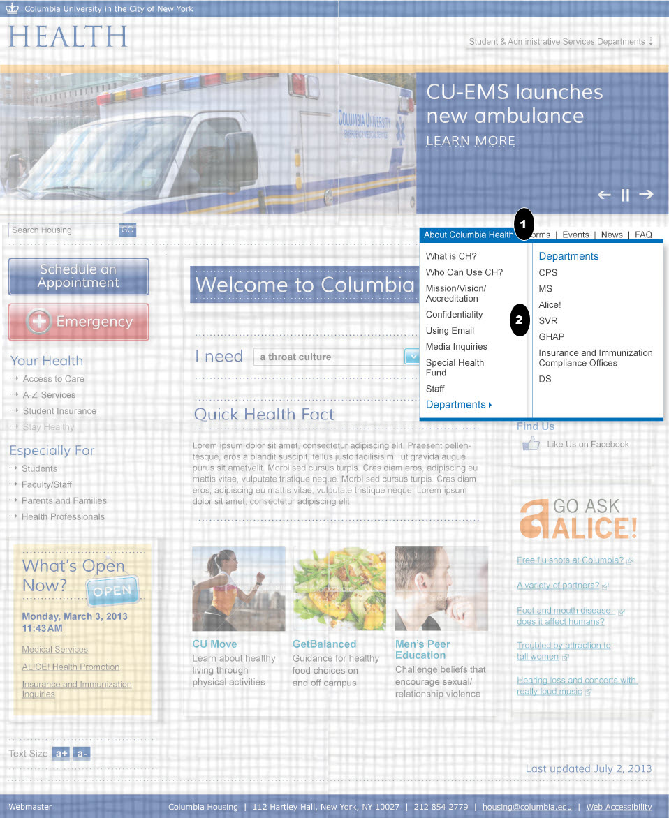
- Role Name Value (States)
- You should also use ARIA to make the information about the visual relationships accessible to assistive technology. Use aria-haspopup to show that the menu links have popup menus and to explicitly show the relationship between the sub menu and the menu link. See http://www.w3.org/TR/wai-aria/states_and_properties#aria-haspopup
- You should also use ARIA to make the information about the state of the link accessible to assistive technology by using aria-expanded. Toggle aria-expanded="true" when sub menu is shown and to ”false” when the sub menu is not shown.
- The popup belongs to the link is clear visually. It should also be clear in the code, either because it is a DOM descendant or pointed to by the aria-owns attribute.
- Keyboard Accessibility
- The link must be expandable via the keyboard and not just via a mouse. You can use the focus() or blur() events to support this. See http://accessibility.athena-ict.com/aria/Javascript-jquery-accessibility.shtml for details.
- The link will also need to support focus and be in the page tabbing order. See http://www.w3.org/TR/wai-aria-practices
.
|
| 08.02 |
1.3.1
1.3.1
2.4.3
1.1.1
4.1.2
1.1.1
2.1.1 |
- Section Headings
- The sub-titles be marked up in as a third level headings.
- Semantic Mark Up
- List of links should be marked up as unordered lists.
- The links on the left of the panel control the content of the right hand side of the panel. The list container on the left should use the aria-controls attribute to explicitly show this relationship. See aria-controls.
- Focus and Reading Order
- Make sure the reading order (source code order) of the elements in this section are logical and convey the same meaning as the visual reading order of the section. For example, the submenu should be read (when expanded) just after it's parent link.
- Role Name Value (States)
- If CSS classes are used to toggle the visible display, that information should be semantically available by using aria-hidden. Toggle aria-hidden="true" when text is hidden and to ”false” when text is shown. Use aria-expanded on the link. See http://www.w3.org/TR/wai-aria-practices
- You should also use ARIA to make the information about the state of the link accessible to assistive technology by using aria-expanded. Toggle aria-expanded="true" when sub menu is shown and to ”false” when the sub menu is not shown.
- Images
- If the arrow icons to the left of these menu links show if the link is collapsed or expanded, then their alt text should state that information. (E.g. alt="expanded" ).
- Keyboard Accessibility
- The links on the left must be expandable via the keyboard and not just via a mouse. You can use the focus() or blur() events to support this. See http://accessibility.athena-ict.com/aria/Javascript-jquery-accessibility.shtml for details.
- The link will also need to support focus and be in the page tabbing order. See http://www.w3.org/TR/wai-aria-practices.
|
Note
 Indicates page components or parts of pages that are either out of scope or have already been covered in a previous comp.