 Back to index
Accessibility recommendations
| ID |
WCAG |
Recommendations |
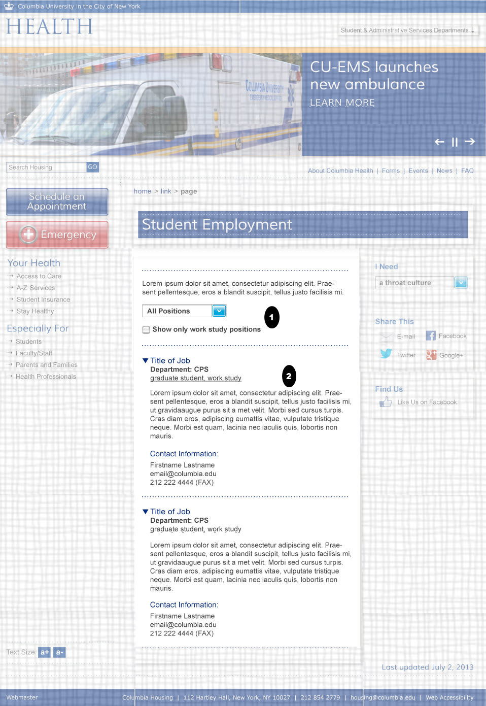
| 05.01 |
3.3.2
3.2.1
2.1.1
4.1.2
1.3.1
|
- Labels
- Make sure a label is explicitly associated with the combo box, using the for and id attributes. If there is no label text you can add a label for screen readers using the aria-label attribute.
- On Input
- Inform users about what will happen when an option is chosen from this drop down menu, or add a "go" button like the one located after the search (to allow screen reader users complete control over this option).
- Keyboard / Name, Role, Value
- "Faux" form controls are often very difficult for accessibility because their roles and names are not always conveyed to screen readers and other assistive technologies. If the select is built with CSS and JavaScript instead of using a real select element (much more likely to be accessible), use ARIA to make sure it is fully operable and compatible with keyboards and assistive technologies. See http://www.w3.org/TR/wai-aria-practices for more information.
- Grouping relationships
- Group related controls that belong together in a fieldset with a legend. (see http://www.w3.org/TR/WCAG20-TECHS/H71.html) You can also use the aria-controls attribute to show that the field set controls the search results area
|
| 05.02 |
1.3.1
1.3.1
2.4.3
1.1.1 |
- Section Headings
- The sub-titles (job titles) be marked up in as a second level heading for the page. "contact information" should be tagged as a third level heading.
- Semantic Mark Up
- The text in bold should be marked as emphasized text using heading, strong or <em> tags (not spans or bold tags).
Style with CSS if needed.
- Finding new content
- When New content is produced the user is needs to be able to find it and alerted to it, without being disturbed from their current task. You can use Aria-live="polite" to achieve this.
- Decorative Images
- If the arrow icons to the left of these menu links show if the link is collapsed or expanded, then their alt text should state that information. (E.g. alt="expanded" or alt = "collapsed" ). You should also use Aria states to show that information (aria-expanded). However, if the arrows are the same regardless and the images are only decorative images then the img element must have an empty alt text (alt="").
- Also, If the sub topics are plain links text ignore this section, however if they the sub text that becomes visible when the header is clicked then the state information of each heading should be in the mark up. If CSS classes are used to toggle the visible display, that information should be semantically available by using aria-hidden and aria-expanded. Toggle aria-hidden="true" when text is hidden and to ”false” when text is shown. Use aria-expanded on the link. See http://www.w3.org/TR/wai-aria-practices
|
Note
 Indicates page components or parts of pages that are either out of scope or have already been covered in a previous comp.
