 Back to index
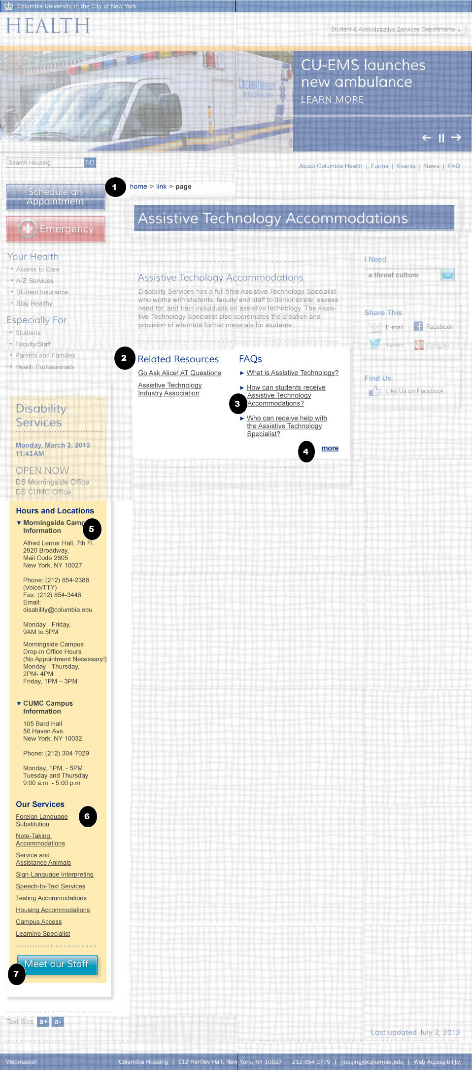
Accessibility recommendations
| ID |
WCAG |
Recommendations |
| 02.01 |
2.4.1
4.1.2 |
- Bypass Blocks
and Name, Role Value
- The breadcrumbs should be inside a landmark role of navigation with aria-label =" breadcrumbs".
|
| 02.02 |
1.3.1
1.3.1 |
- Section Headings
- The text "Related Resources" and "FAQs" should be marked up in as a second level heading for the page
- Lists
- The list of links under each heading should be marked up as unordered lists.
|
| 02.03 |
4.1.2
2.4.7
1.1.1 |
- Name, Role, Value
- If the FAQs are plain links then ignore this section, however if they have text that becomes visible when clicked then the state information of each FAQs should be in the mark up. If CSS classes are used to toggle the visible display, that information should be semantically available by using aria-hidden and aria-expanded. Toggle aria-hidden="true" when text is hidden and to ”false” when text is shown. Use aria-expanded on the link. See http://www.w3.org/TR/wai-aria-practices
- Focus Order:
- The FAQ questions are active elements but if they are not marked up as links then they will do not receive focus in the tabbing order .If necessary, use tabindex to put each FAQ in the tabbing order. See http://www.w3.org/TR/wai-aria-practices for more information.
- Decorative Images
- If the arrow icons to the left of these menu links show if the link is collapsed or expanded, then their alt text should state that information. (E.g. alt="expanded" or alt = "collapsed" ) However, if the arrows are the same regardless of what link is selected then the images are only decorative images and should be integrated through CSS, or if clickable as part of the link, the img element must have an empty alt text (alt=""). If the decorative icon is integrated in HTML and clickable, then it must be part of the same link.
|
| 02.04 |
3.4
|
- Link Context
- The “more” link may need to have a title attribute or aria-label = "More FAQs" in order for the link to make sense out of context.
|
| 02.05 |
4.1.2
2.4.7 |
- Name, Role, Value
- If CSS classes are used to toggle the visible display, that information should be semantically available by using aria-hidden and aria-expanded. Toggle aria-expanded = " false and aria-hidden="true" when text is hidden and to aria-expanded (on the link) to "true and aria-hidden = ”false” when text is shown. http://www.w3.org/TR/wai-aria-practices
- Focus Order
- If the visual display is toggled when pressing on text make sure all active elements receive focus in the tabbing order .If necessary, use tabindex to put each FAQ in the tabbing order
|
| 02.06 |
1.3.1
1.3.1
1.1.1
|
- Section Headings
- The text "Our Services" should be marked up in as a second level heading for the page
- Lists
- The menu should be built using an unordered list for mark up.
- Decorative Images
- The arrow icons to the left of these menu links should be integrated through CSS, or if clickable as part of the link, the img element must have an empty alt attribute (alt=""). If the icon is integrated in HTML and clickable, then it must be part of the same link.
|
| 02.07 |
1.4.5
1.4.3
2.4.7 |
- Name, Role Value
- Use and HTML button or a link with role="button". For example: <a href="foo.html" role="button">Meat our staff</a>
- No Images of Text (Creative)
- Use true text and not images of text. The only text that should be embedded in images is "logotext".
- Color Contrast (Creative)
- The color contrast luminosity ration for large text (18 point or 14 point bold) required is 3 to 1. As designers are picking colors, consider using these tools to test color contrast http://snook.ca/technical/colour_contrast/colour.html
|
Note
 Indicates page components or parts of pages that are either out of scope or have already been covered in a previous comp.
