| ID |
WCAG |
Recommendations |
| 03.01 |
1.3.1
1.1.1 |
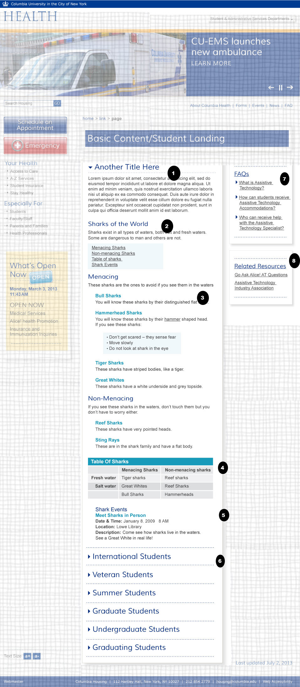
- Section Headings
- The title text be marked up in as a second level heading for the page
- Decorative Images
- If the arrow icons are only decorative images they should be integrated through CSS, or if clickable as part of the link, the img element must have an empty alt text (alt=""). If the decorative icon is integrated in HTML and clickable, then it must be part of the same link.
|
| 03.02 |
1.3.1
1.3.1 |
- Section Headings
- The text "sharks of the world" and similar headings should be marked up in as a third level heading for the page
- Lists
- The list of links should be marked up as unordered lists.
|
| 03.03 |
1.3.1
1.3.1
2.4.7 |
- Section Headings
- The text "sharks of the world" and similar headings should be marked up in as a third level heading for the page
- Lists
- The list of links should be marked up as unordered lists.
- Color Contrast (Creative)
- The color contrast for the light blue text is low for normal text and borderline for large text. Make sure the luminosity ration for large text (18 point or 14 point bold) is over 3 to 1. I text is smaller the 18 points or 14 points bold the text must have a contrast ratio of at least 4.5:1. As designers are picking colors, consider using these tools to test color contrast http://snook.ca/technical/colour_contrast/colour.html
|
| 03.04 |
2.4.7
1.3.1 |
- Color Contrast (Creative)
- The color contrast for the whit text with a light blue text is low for normal text and borderline for large text. Make sure the luminosity ration for large text (18 point or 14 point bold) is over 3 to 1. I text i smaller the 18 points or 14 points bold the text must have a contrast ratio of at least 4.5:1. As designers are picking colors, consider using these tools to test color contrast http://snook.ca/technical/colour_contrast/colour.html
- Data Tables
- Use table headers in table cells to explicitly associate table cells with their headings.
For example:
<tr ><th scope="row">Fresh Water</th><td>...</td>..</tr>
|
| 03.05 | 2.4.7
1.3.1 |
- Color Contrast (Creative)
- The color contrast for the light blue text is low for normal text and borderline for large text. Make sure the luminosity ration for large text (18 point or 14 point bold) is over 3 to 1. I text is smaller the 18 points or 14 points bold the text must have a contrast ratio of at least 4.5:1. As designers are picking colors, consider using these tools to test color contrast http://snook.ca/technical/colour_contrast/colour.html
- Section Headings
and Semantic Markup
- Heading need to be marked correctly in the appropriate heading tags, (<h1> <h2> etc.)
- The text in bold should be marked as emphasized text using heading, strong or <em> tags (not spans or bold tags).
Style with css if needed.
|
| 03.06 |
4.1.2
2.4.7
1.1.1 |
- Name, Role, Value
- If CSS classes are used to toggle the visible display, that information should be semantically available by using aria-hidden and aria-expanded. Toggle aria-expanded = " false and aria-hidden="true" when text is hidden and to aria-expanded (on the link) to "true and aria-hidden = ”false” when text is shown. http://www.w3.org/TR/wai-aria-practices
- Focus Order:
- If the visual display is toggled when pressing on text make sure all active elements receive focus in the tabbing order. If link text are not HTML anchors, use tabindex to put each click-able text in the tabbing order
- Decorative Images
- If the arrow icons to the left of these menu links show if the link is collapsed or expanded, then their alt text should state that information. (E.g. alt="expanded" or alt = "collapsed" ) However, if the arrows are the same regardless of what link is selected then the images are only decorative images and should be integrated through CSS, or if clickable as part of the link, the img element must have an empty alt text (alt=""). If the decorative icon is integrated in HTML and clickable, then it must be part of the same link.
|
| 03.07 |
1.3.1
4.1.2
2.4.7
2.4.1
4.1.2
1.1.1 |
- Section Headings
- Heading need to be marked correctly in the appropriate heading tags, (<h1> <h2> etc.)
- Name, Role, Value
- If CSS classes are used to toggle the visible display, that information should be semantically available by using aria-hidden and aria-expanded. Toggle aria-expanded = " false and aria-hidden="true" when text is hidden and to aria-expanded (on the link) to "true and aria-hidden = ”false” when text is shown. http://www.w3.org/TR/wai-aria-practices
- Focus Order:
- If the visual display is toggled when pressing on text make sure all active elements receive focus in the tabbing order. If link text are not HTML anchors, use tabindex to put each clickable text in the tabbing order
- Bypass Blocks and Name, Role Value
- A landmark role of complementary should be added to the header element.
- Decorative Images
- If the arrow icons to the left of these menu links show if the link is collapsed or expanded, then their alt text should state that information. (E.g. alt="expanded" or alt = "collapsed" ) However, if the arrows are the same regardless of what link is selected then the images are only decorative images and should be integrated through CSS, or if clickable as part of the link, the img element must have an empty alt text (alt=""). If the decorative icon is integrated in HTML and clickable, then it must be part of the same link.
|
| 03.08 |
1.3.1
2.4.1
4.1.2 |
- Section Headings
- Heading need to be marked correctly in the appropriate heading tags, (<h1> <h2> etc.)
- Bypass Blocks and Name, Role Value
- A landmark role of complementary should be added to the header element.
|
 Back to index
 Indicates page components or parts of pages that are either out of scope or have already been covered in a previous comp.